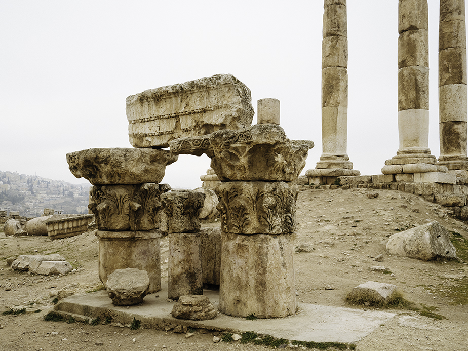
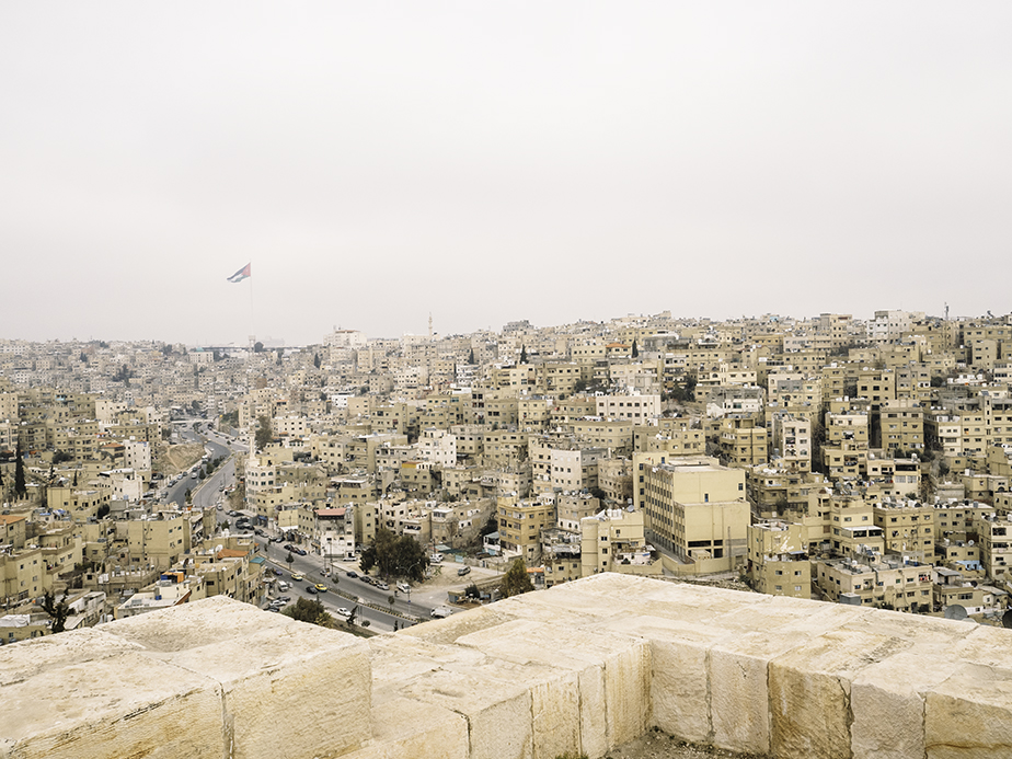
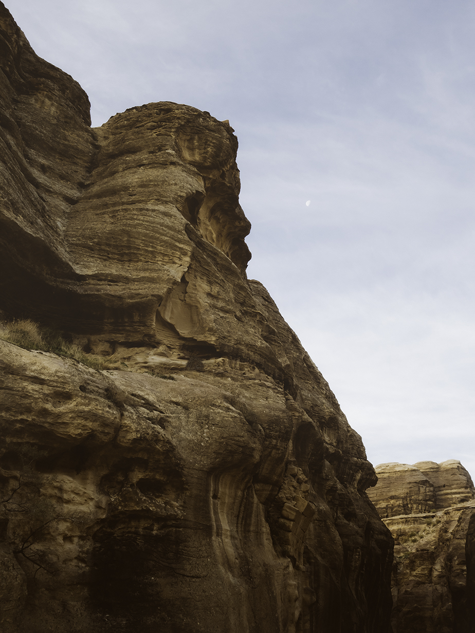
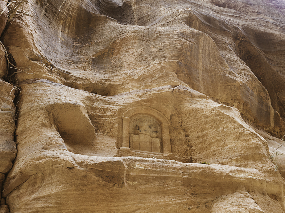
Editing the images shot in Jordan is proving difficult. I am struggling with the colour palette in ways I did not expect. Jordan is, as you might imagine, almost entirely desert. And that means dust, sand, stone and concrete, in varying shades of soft pastel yellows, oranges, browns and reds. Barely a scrap of green to be seen, save for a handful of street trees in the city and the olive tree orchards dotted about outside the capital Amman. Being January, it is winter, so the overcast sky was mostly filled with grey flat clouds. The smog (trapped by the cloud cover) coloured the sky with a dirty brown to pink hue. No white clouds to balance the tones, or to let your eyes rest. Monotonous, analogous, (monogamous!), monochromatic colour.
Every so often the clouds would break open and blue sky would shine through like a jewel. It was glorious. But now I look at these blue-skied images and think - they don't fit - they're too different.
Yes I could just change the tones, remove the dirty pink from the clouds, cool the brown-greys or warm the blues to make everything feel cohesive. But would that be an accurate representation of the place? And, is that what I want to achieve?
Iceland might have been an icy blue all over, but it has nothing on the dusty shades of Jordan.