Work selected for Don'tTakePictures.com online exhibition LUMENS

See the exhibition LUMENS here: http://www.donttakepictures.com/gallery-lumens/

Great news! On of my lumen images has been selected for online exhibition at donttakepictures.com. Don’t Take Pictures had an open call out for lumen images to be submitted for consideration. They selected 45 images from across the world for inclusion in their online exhibition LUMENS which is on view from 22 August - 20 November 2018.

Who are Don’t Take Pictures?

Don’t Take Pictures are a photography magazine that is published twice a year (in print!), they also have regular articles and online exhibitions on their website plus the usual socials instagram and facebook. They also run a print shop for the artists featured in the print magazine - where the artists receive the full amount of the purchase price. Which is pretty damn ace and supports the careers of the artists directly! Check the prints out here.

Stephanie RICHTER Backyard lumen experiment (Unit 8's Native Mint bush) 2017

Artist talks... so much more intimidating when you're the artist

The CCP ran a cute public program on Friday night to give the artists a chance to talk about their winning works. It was fun. Thanks for having me!

Judges & Winners Speak
Friday 8 December, 6–7:30pm
Join us after hours for a glass of wine and hear from CCP Salon winners speaking about their winning ways with photography.

I have organised and facilitated a billion artist talks over the past 10 years at MGA. I thought that speaking for five minutes about my book would be very straight-forward and with my public speaking experience, simple.

I was so wrong.

I now have a deeper appreciation for what I’m asking of artists when they speak at MGA!

Photos of the talk in action thanks to my hype girl Katie Tremschnig.


Looking backwards

I've been spending some time reviewing, and in some cases re-editing photographs from past trips. I'm putting together some photobooks, one per destination, that combines my images with those taken by my partner. These books are just for us, as memory keepers for our travels.

Adding some distance between shooting your images, and reviewing them, can be enlightening. It reminds me of the gap between shooting film, processing it, and then printing the images. Days, weeks, months or even years might go past as you forget, or temporarily misplace, a roll or two.  You gain some time, and some objectivity. 

Your sense of what’s important changes, do you really need to have a chronological day-by-day, sight-by-sight diary of your trip, or can you play with alternate narratives?

I’m using my fav drag-and-drop photobook builder for this project, Artifact Uprising, because I dig their environmentally responsible production and 100% recycled paper stock. Not an ad, I just really like them and first printed through them way back in 2003.

Sneak peek of the first two covers

Cloth-covered hardcover books with the partial book jacket. I’ve picked the fabric colour to match with our experience of the colour of the landscapes we visited. Hong Kong was pastel pink buildings everywhere. Seoul in the spring was a deep green against the bare earth. These are slow projects, but I’m enjoying reliving our past experiences with new eyes.

CCP Salon 2017 - Winner - Best use of natural light

Well, that escalated quickly…

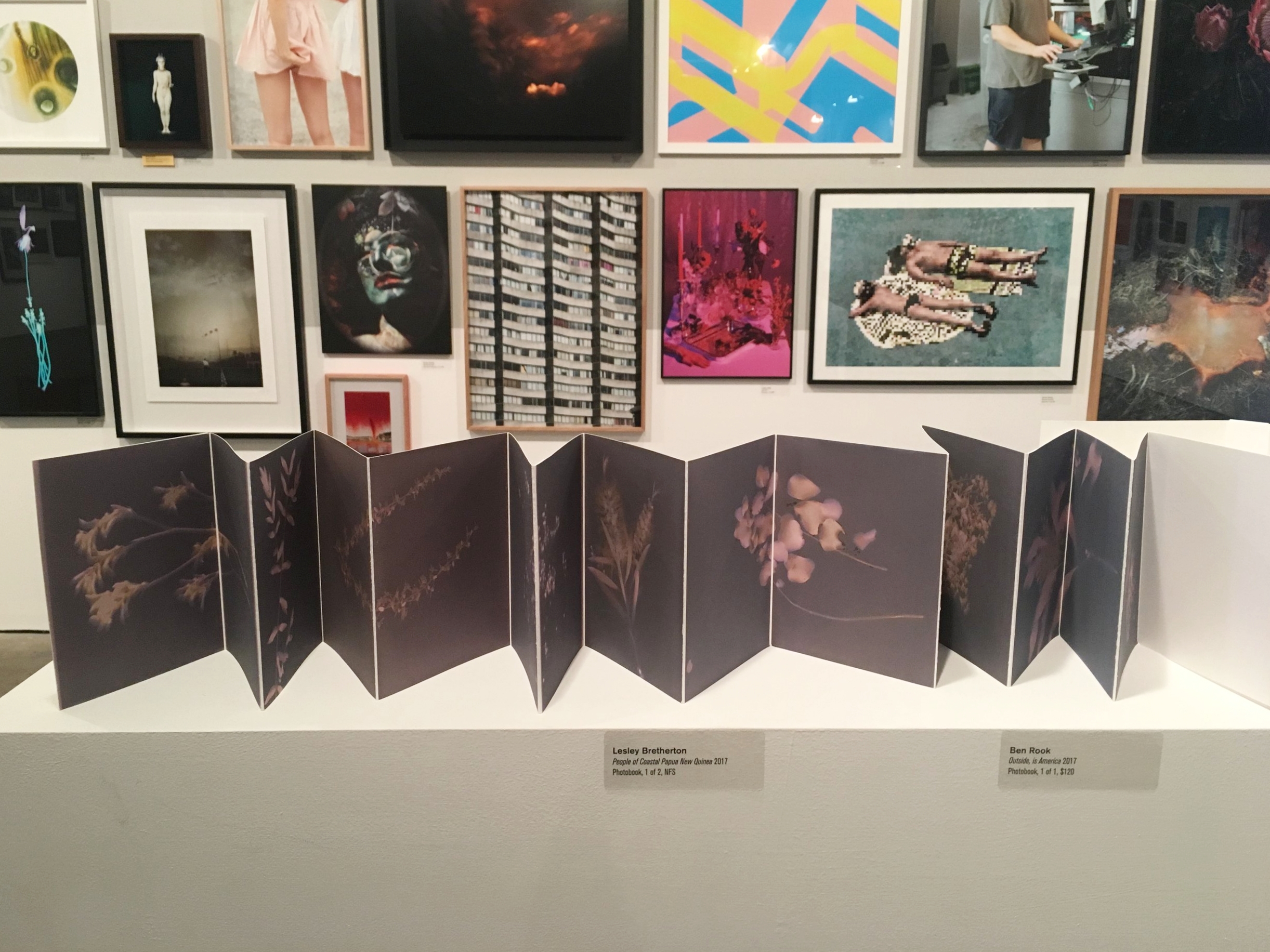
Just a few months ago, I was pottering about in my backyard, making lumens for myself. I love the concertina photobook format, and I feel it works best with a small, cohesive series of images that can work individually or when viewed as a whole.

As I continued making lumens with plants foraged from my neighbour’s yards, I felt they would sit nicely together in this way, and worked towards completing the book for the end of the year. Having a deadline is always motivating for me, so I set myself the challenge to enter this photobook to the CCP Salon. I usually enter a print or two as a fun way to celebrate the end of year - but making a book, that was a whole other ball game.

Fast forward through many trials and tests – those following along on instagram would have seen much of this in my stories – I completed the book just in time to drop it off for the salon.

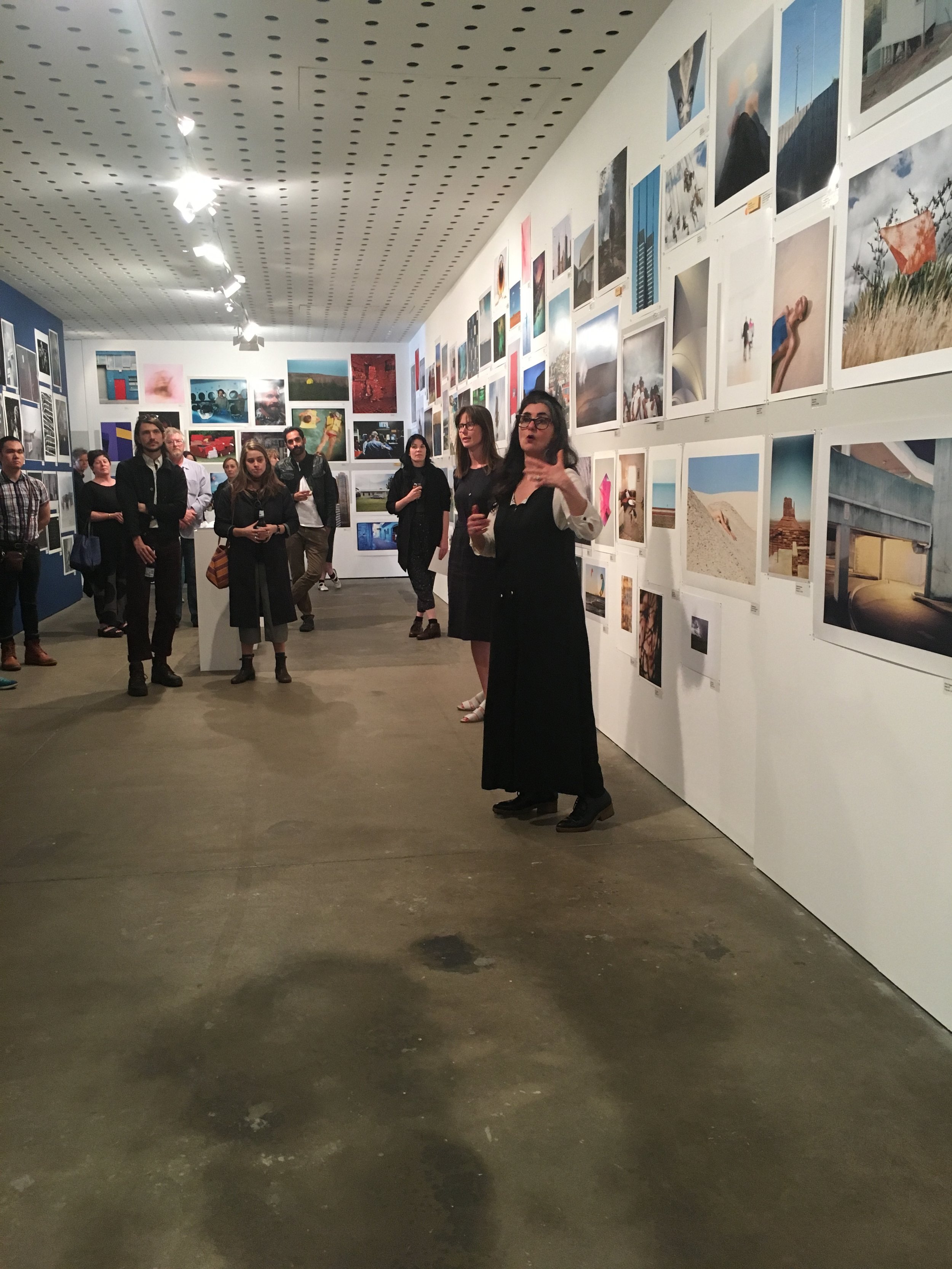
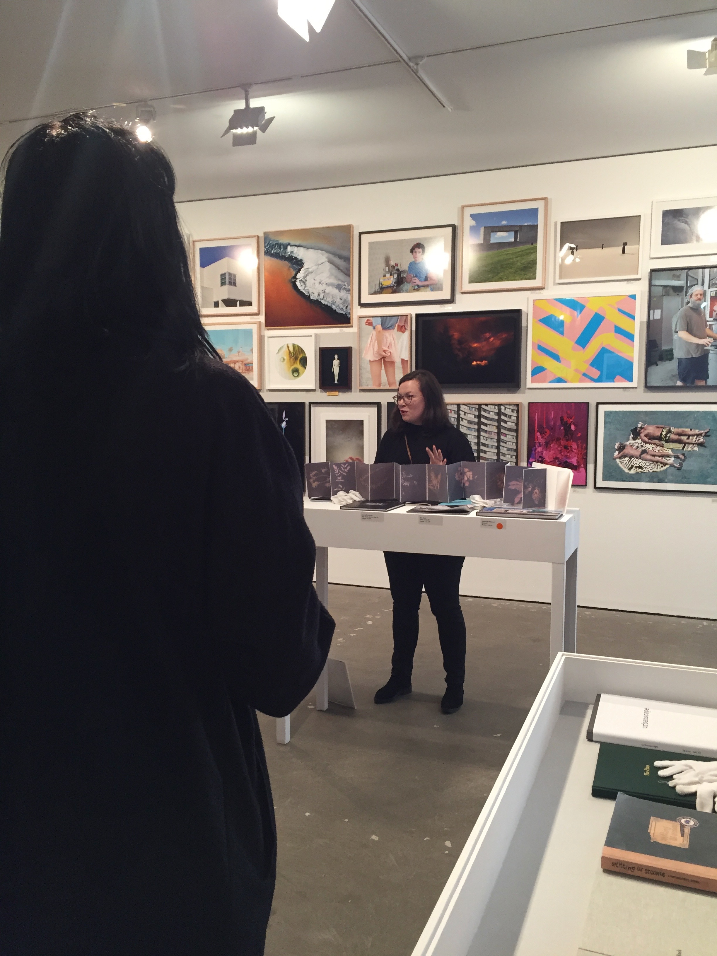
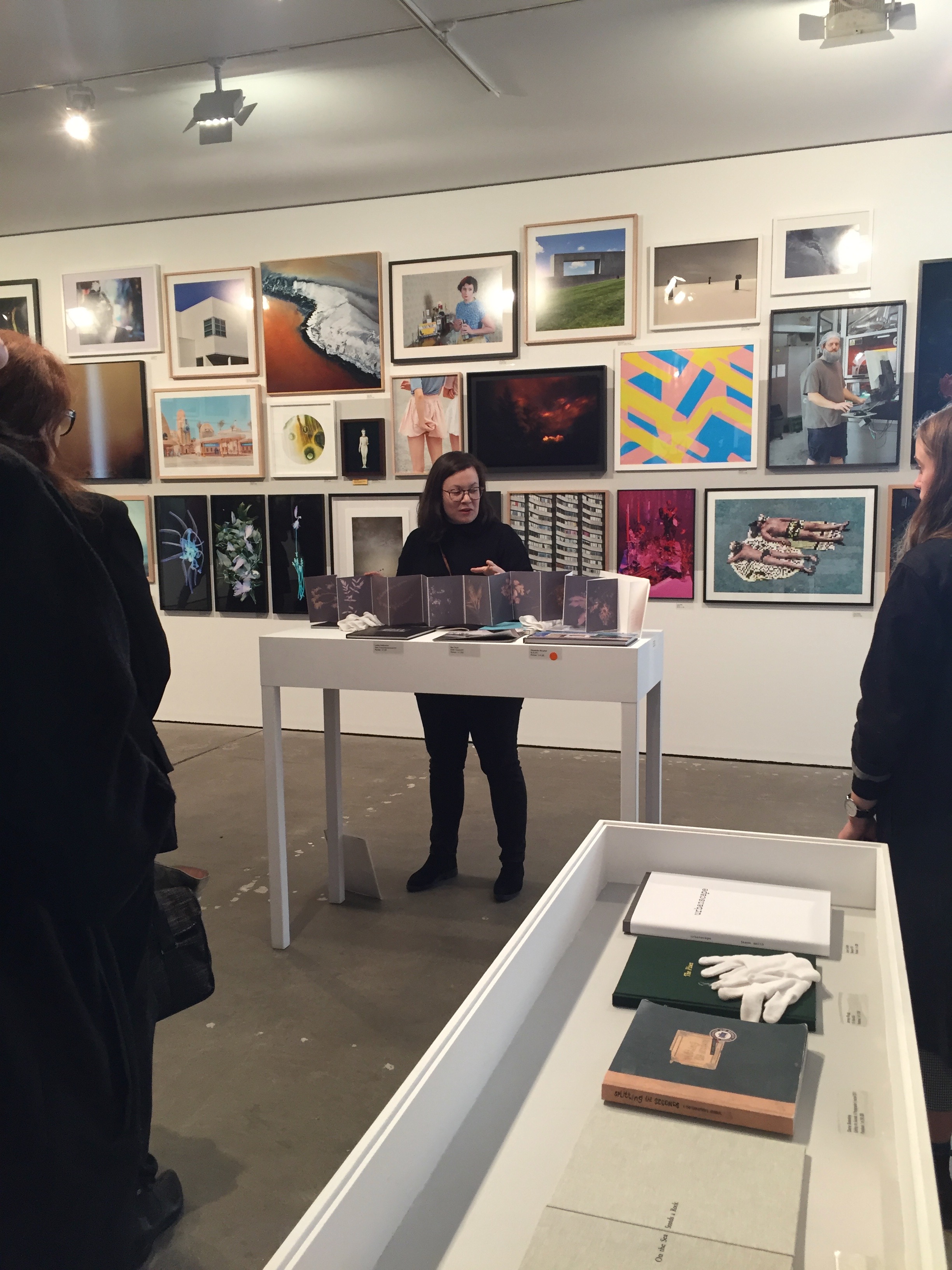
I attended the opening on an incredibly hot and sticky evening, and as the speeches were about to start I departed to avoid being stuck inside with a sea of humanity. The CCP salon opening is always well attended and if you’re in the room when the speeches start there is no way out until they end. The CCP Salon gives 30 separate awards…I had friends waiting outside who had given up on the heat half-an-hour earlier… It seemed like the best time to leave.

Not a moment later I got a call from a friend sensibly watching the announcement at home on a live stream, she wasn’t making sense ‘I HEARD YOUR NAME!’ she shouted. ‘Go back! You’ve won something!’. I naturally did not believe her. It turns out she was correct, and mine was the first award announced on the night. I missed my moment of fame by less than 5 minutes, cue: face palm.

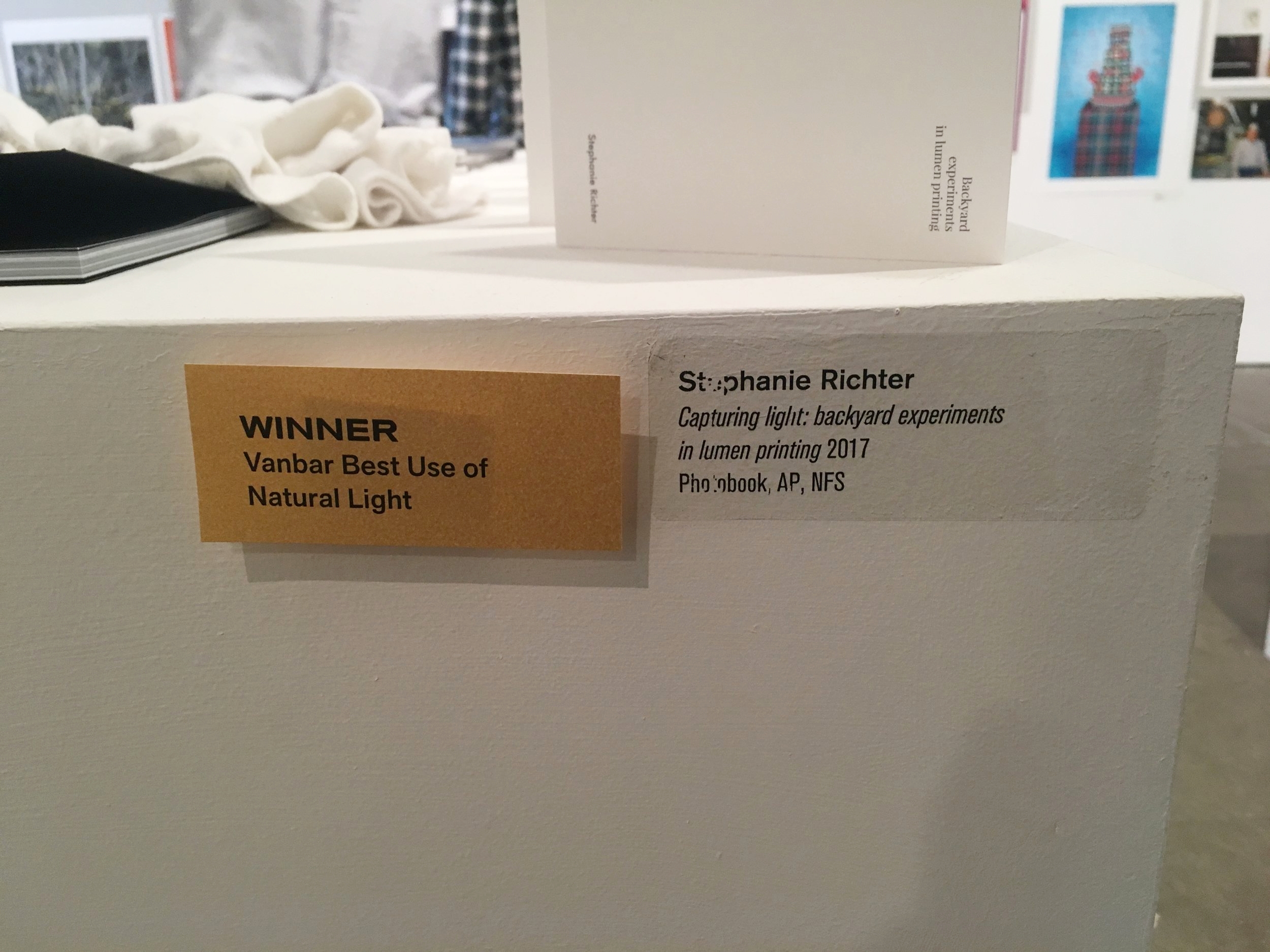
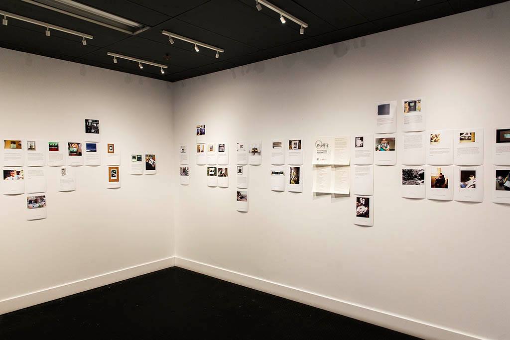
I was both shocked and surprised (in a good way), and thrilled to have my handmade photobook awarded ‘Best use of natural light’ at the 2017 CCP Salon, the 25th iteration of the annual open entry prize (and second year that photobooks could be entered). The judges were: Hoda Afshar, Artist; Elias Redstone, Independent Curator; Pippa Milne, CCP Curator. Thank you so much to the judges, CCP and the award sponsor Vanbar.

You can see all the excellent winners on the CCP website

What a way to end the year!

New in PROJECTS: Capturing light: Lumen prints in my garden

Stephanie Richter Untitled (backyard lumen experiment 1 - Bottlebrush) 2017 gelatin silver print 20.3 x 25.4 cm
other details: Ilford fibre based classic glossy paper !0 minute exposure in full winter sun.

Photograms, rayographs, shadowgrams, whatever you want to call them, not much could simpler in photography.

Place your subject (for example, a plant cutting) on a light-sensitised surface, expose to the light source required for that surface, remove your object and then make the resulting image permanent. Volià - a photogram! The choices of light-sensitised surfaces are broad, I'm not exaggerating to say that almost all photographic processes can be used to create a photogram, from the early cyanotype through to the contemporary document scanner, and everything in between.

With Lumen prints, you're using black-and-white (gelatin silver) paper and the sun/UV light (some artists have been known to use starlight or a full moon). Plus some paper fixer to make the image permanent. It can be as quick and simple as you like (a plant-cutting and a 10minute exposure to the sun, as seen in my example) - or you can construct complex compositions, involve your body, or expose the print for 24hours/days. Variables in paper type, age, previous exposure to light (fogging) and paper surface will, along with length of exposure and moisture levels during exposure, give you varied depth of tone and colour in your resulting prints. Lumen printing is full of opportunities to experiment to your heart's desire. 

I'm planning to attempt some toning/staining of future prints with items from around the house (tea, coffee, red wine etc...) in my next experiment. 

WORKSHOPS: Coming up in late September I'm running some photogram Lumen Print workshops for MGA at the inaugural Bright Festival of Photography, in the picturesque Victorian high country alpine region. I'd love to invite you along, but the event has sold out! Keep an eye on MGA's instagram stories for the event.

  • Keep an eye under PROJECTS for the continuation of this series

Stephanie Richter Untitled (backyard lumen experiment 2 - Wattle) 2017 two gelatin silver prints 20.3 x 50.8 cm
other details: Ilford fibre based classic glossy paper ,25 minute exposure in overcast winter light

Playing with alternative photographic processes: The process of experimentation from photograph to photogravure

The brilliant blue of glacial ice is so vibrant I struggle to describe it. Think bubble gum, blue heaven flavouring, blue jelly cups, and blue Curaçao liqueur. When you're standing within an ice cave, with the sunlight streaming through from above, it appears to glow. It is a contradictory sight, both from nature and seemingly an unnatural colour. 

Original colour

Black and white


What to do about the blue?

The (un)natural blue is overwhelmingly 'other', both distracting and enticing. I wanted to focus instead on what is trapped in the ice: the sediment, the dirt, and the holes and tunnels created by the melting of the glacier. The first solution was to remove the colour and allow the higher contrast of black and white to highlight the texture of the ice and its inclusions. But I felt like something was lost with the removal of the blue completely, it no longer had that connection to the glacier. My concerns were confirmed by others who questioned if they were looking at microscopic images of plants or cells - glacial ice certainly didn't spring to mind! Now you could take a Neil DeGrasse Tyson view on this - "We are all connected; To each other, biologically. To the earth, chemically. To the rest of the universe atomically." and this confusion between the macro and the micro, between biological and geological just adds to the layers of meaning that might be extracted from this series. But I really feel like the blue is an important marker for the work and ties it back to where it was made.

Testing and adapting ideas

I suppose the most obvious question is - why not just create the look you're after in lightroom or photoshop and hit print. And that is one possibility that I could come back to for sure, but right now that feels too easy, and I'm not learning anything that feels new with that process.

The first photographic printing process that sprung to mind for me was Cyanotype. What subject could possibly suit the cyan colour more than this?! But the results were too blue, and too abstract. Without the contrast of the black shadows and dirt in the ice the whole image appeared very flat. I'm not even going to include it here as it just looked rubbish. 

But I didn't want to give up on the cyanotype blue completely, so I coated some paper with different washes of the mixed chemicals. Layering the washes to give it a more 'colour field' or watercolour wash effect.

I thought perhaps I could print the black shadow areas, over the top of the cyanotype colour field, to achieve both the colour, contrast and detail I was aiming for. There are a few options when it comes to overprinting, I planned to test both ink-jet and a more traditional printing process - the photogravure. 


Cyanotype colour fields

A timelapse of one of the cyanotypes exposing. Held up to catch the last hour of sunshine. What appears to be a darker patch is where the chemicals had not dried before exposure - this will actually be the lightest area on the page after washing and…

A timelapse of one of the cyanotypes exposing. Held up to catch the last hour of sunshine. What appears to be a darker patch is where the chemicals had not dried before exposure - this will actually be the lightest area on the page after washing and drying.

Exposure complete (technically a little over exposed). After washing and drying the tones are basically inverted, You can see the result in the image below. The is the Berger COT320.

Exposure complete (technically a little over exposed). After washing and drying the tones are basically inverted, You can see the result in the image below. The is the Berger COT320.

If you've made a few cyanotypes before you'll quickly realise that the quality of the paper you use, the humidity of the environment, the pH level of your washing water, and strength of your sunlight (time of year and day)/uv box all contribute to different final blue outcomes (not even mentioning the variables that occur within your chemical mix).

Cyanotype colour fields L-R 300gsm canson watercolour paper pad (has a light texture) [used in Test 3], Berger COT 320 (made for alternative photographic processes with no chemical additives to the paper. Not used in this testing printing round), cheap cartridge-like watercolour paper [used for Tests 1&2]

I used to counsel my students that they should leave their perfectionism at the door when working in alternative photographic processes. Now this isn't completely true of course, if you minimise your variables, test regularly, keep meticulous notes, and practice, practice, practice - you will certainly create the best environment for success and repeatable results. In the case of the cyanotype colour fields, I'm not looking for perfect even colour, I deliberately played with paper types, layering washes of chemicals, brushes and glass chemical pusher application, leaving some areas wet during exposure, and adding in variables such as salt for texture. 

Photogravures

With the over-printing of photogravure on cyanotype not giving me the result I had envisaged. I moved on to testing out some different black, blue and combination printing inks.

Test 3.1 and 3.2 are the first two plates that were made. Slightly different print settings when making the plates (aiming for a deeper black) and also a different black ink.

Test 4.1 inked up and its resulting print 4.2 sought to create a similar effect to printing on top of blue paper - but in reverse. The black ink beneath a thin layer of blue ink rolled over the top. A great idea, but it just muddied the fine details of this image.

[Test 5] A custom mix of blue and black inks (thanks to Silvi at The Baldessin Press for mixing this perfect tone!) on etching paper. Happy very with this tone. I think it finds the right balance of icy-blue without overpowering the image.

Suppliers

Cyanotypes: Gold Street Studios (Cyanotype chemical kit; Bergger COT320 paper; glass chemical pusher)

Photopolymer photogravure: The Baldessin Press and the expertise of Silvi Glattauer. You can book your own workshop with Silvi here. The site also has a great video of the process of making a photopolymer plate with Silvi's pioneering direct-to-plate method which eliminates an entire step (no positive film required for exposure) from the more traditional process. It's also worth noting that the polymer plates etch in water (not acid), making it a significantly more environmentally friendly process. For both the earth, and the artist. 

New in DESTINATIONS: Jordan

Dusty, smoky, hazy... did I mention smoky? 

Travelling around Jordan was a fascinating experience. So foreign to my Australian eyes. Memories that float to the surface from my week there are: the ever present cigarette smoke in the air, the traffic that appears to follow few rules, the regular calls to prayer, the muted tones of creamy stone and concrete. Sweet pastries and kunafeh soaked in honey, the friendly people, the metal detectors and security guards on every hotel entrance, the silence of Petra, the cats and kids that follow you around, the overly insistent sales people at every bedouin tent or tourist souvenir shop. The blue skies and views of the desert that stretch for kilometres, seemingly unending, the way the light bounced off the surface of the dead sea, the warmth of the sun on our faces as we floated in the water and watched the most amazing sunset I have ever witnessed.

DESTINATIONS up now:
Jordan [Amman & Jerash]
Jordan [Petra]

Petra, Jordan:

The dusty shades of Jordan

Editing the images shot in Jordan is proving difficult. I am struggling with the colour palette in ways I did not expect. Jordan is, as you might imagine, almost entirely desert. And that means dust, sand, stone and concrete, in varying shades of soft pastel yellows, oranges, browns and reds. Barely a scrap of green to be seen, save for a handful of street trees in the city and the olive tree orchards dotted about outside the capital Amman. Being January, it is winter, so the overcast sky was mostly filled with grey flat clouds. The smog (trapped by the cloud cover) coloured the sky with a dirty brown to pink hue. No white clouds to balance the tones, or to let your eyes rest. Monotonous, analogous, (monogamous!), monochromatic colour. 

Every so often the clouds would break open and blue sky would shine through like a jewel. It was glorious. But now I look at these blue-skied images and think - they don't fit - they're too different.

Yes I could just change the tones, remove the dirty pink from the clouds, cool the brown-greys or warm the blues to make everything feel cohesive. But would that be an accurate representation of the place? And, is that what I want to achieve?

Iceland might have been an icy blue all over, but it has nothing on the dusty shades of Jordan.

New in DESTINATIONS: Iceland

Making photographs in Iceland is, in some senses, a tough gig. There are the seasons (in this case: winter), the daylight or lack thereof (just four hours of perpetual sunrise/sunset), rapidly shifting weather (sunshine, heavy snow, sunshine, blowing winds...all in an hour's drive), there are the CROWDS of tourists all trying to do the same thing as you, there are the limitations of your equipment to consider, the fleeting nature of natural phenomena, and finally there is the beauty. The natural beauty of the place itself, which is quite frankly, impossible to truly capture. The beauty is also what makes it an easy ride - point your camera anywhere and it'll be amazing, walk 20m and see something even more spectacular than the last. I tried to capture what it felt like to move through this ever-shifting landscape.

New in DESTINATIONS:
Iceland i
Iceland ii 

Six weeks, eight countries, fifteen cities...

Six weeks, eight countries, fifteen cities... I'm just back from my travels through a European & Middle Eastern winter. It took me two countries before I had warmed up to using my camera again (and not just my phone), it feels so cumbersome (even with a little mirrorless camera) and screams 'tourist' but then again there's no point hiding the truth. I was there to wander through new places, to experience and to photograph.

I didn't set out with a photographic objective in mind for this trip, this was both a positive and a negative. You're not hunting for scenes and moments that may not exist, and you don't feel like you've failed at capturing something when plans go awry. But - you also don't know what you're looking for or whether you achieved your objective.

I'm intrigued by artists who use their memory of places, people and moments as the launching points for their work. They return to their studios to create works in response. I don't know whether this is about controlling the situation and the outcome or perhaps the fallibility (and malleability) of memory. Possibly both.

For now I'm keywording and categorising my images by things like location, mood, tone, connections and coincidences. I'm not sure where it is headed from here. But I have some memories of places I want to share.

- Steph x

Ps.If you're looking for a travelogue or a '10 tips to finding the best souvenir'-style blog, this is not really the place but check out my instagram for some wanderlust.